Based in Lausanne, graphic designer Chris Gautschi studied at the School of Applied Arts in La Chaux-de-Fonds. His projects focus on the publication of beautiful books for various institutions, but also for museums and independent individuals, for whom he develops communication tools.
After a very inspiring 2.5 years in London, he returned to Switzerland with a very clear idea of what he wanted to do. This time was decisive for the artistic direction he is taking today as a book and editorial designer.
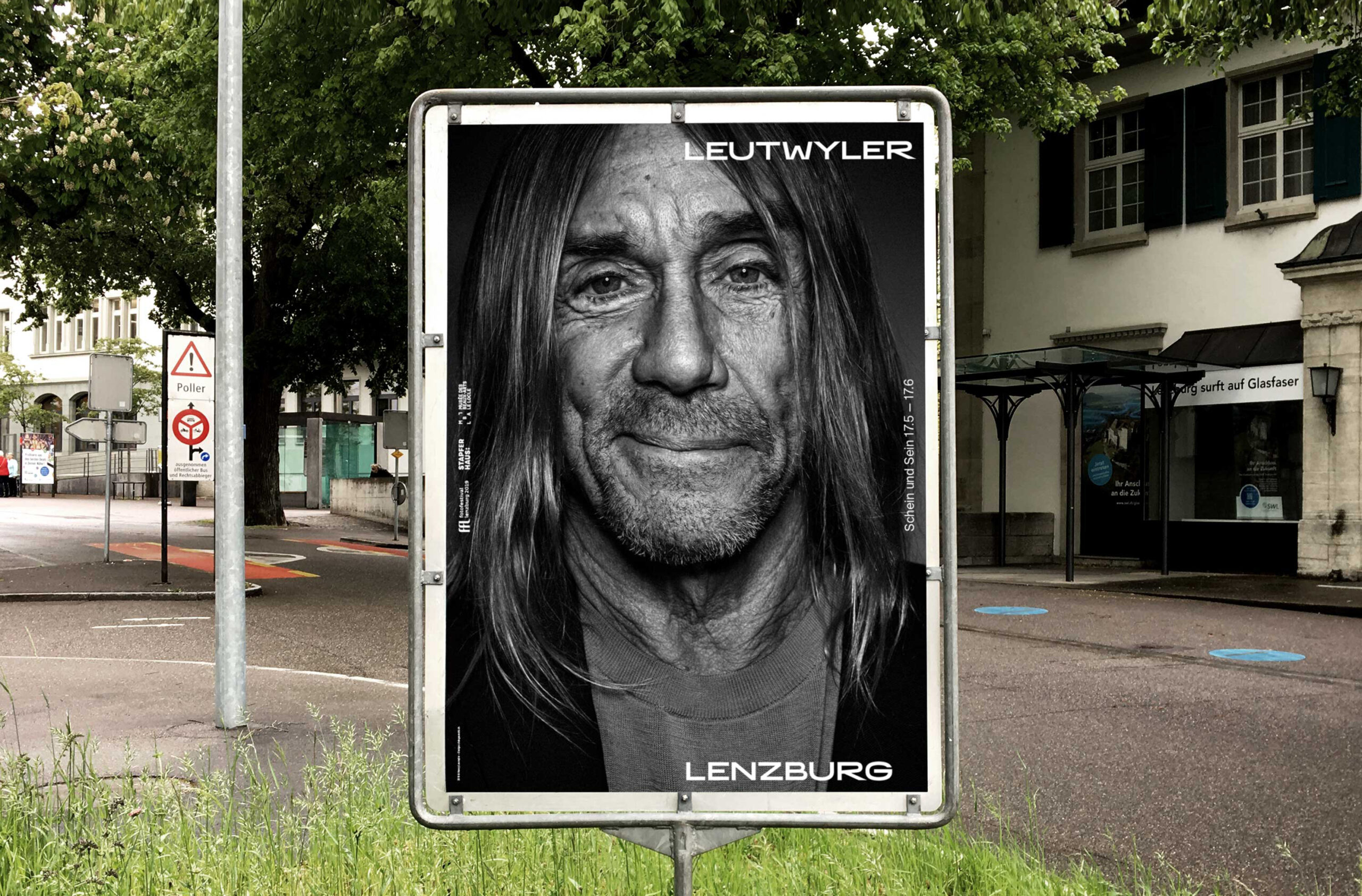
Obviously, a style has emerged, a signature that is recognizable at first glance. He specializes in books on art, architecture, photography and the production of monographs. Among others: La Villa Urbaine, the typology of Lausanne buildings at Birkhauser, Misty Copland by Henry Leutywyler at Steidl. He is currently working on a monograph on the artist Sandrine Pelletier.
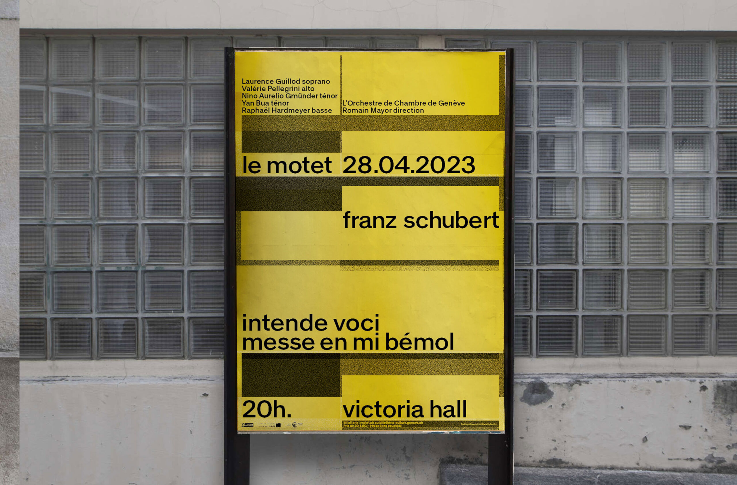
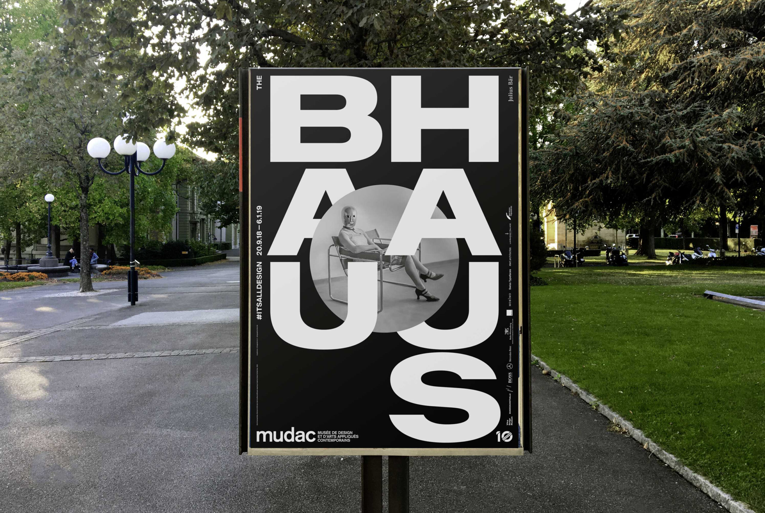
During the Bauhaus exhibition #itsalldesign in 2018, he attracted a great deal of attention worldwide in the field of design and art.
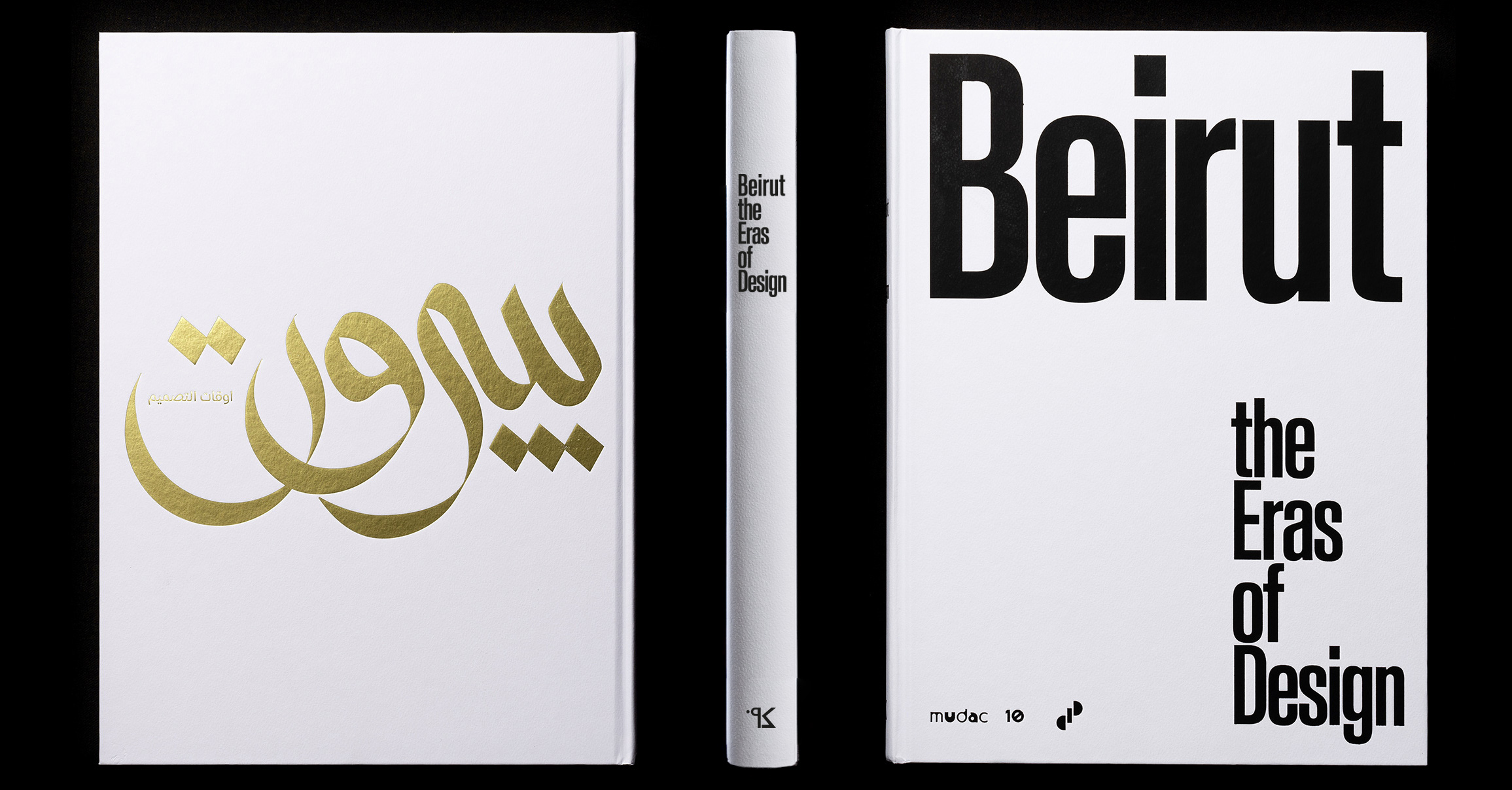
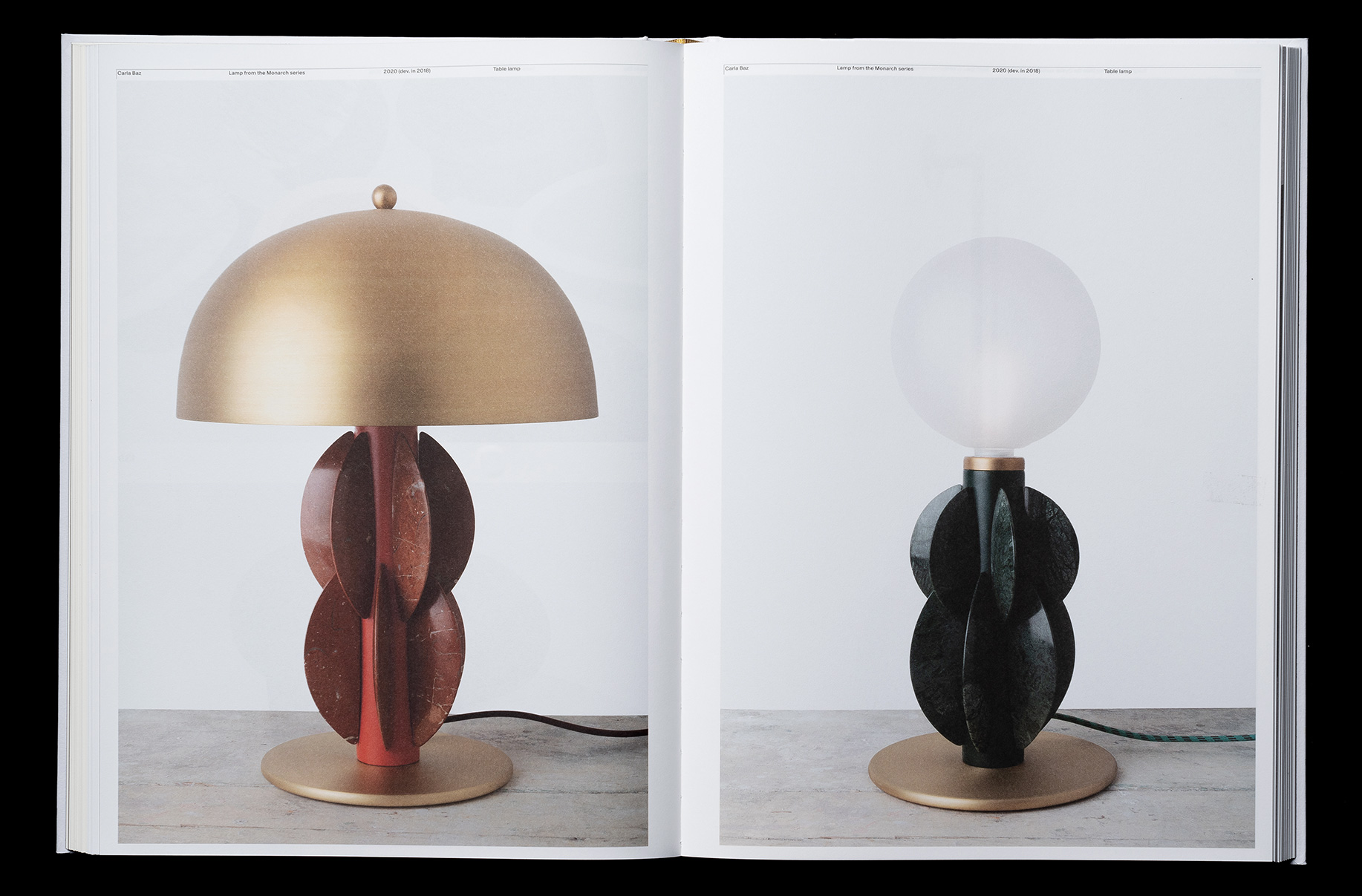
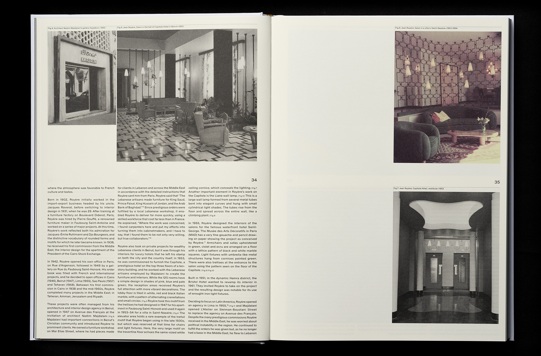
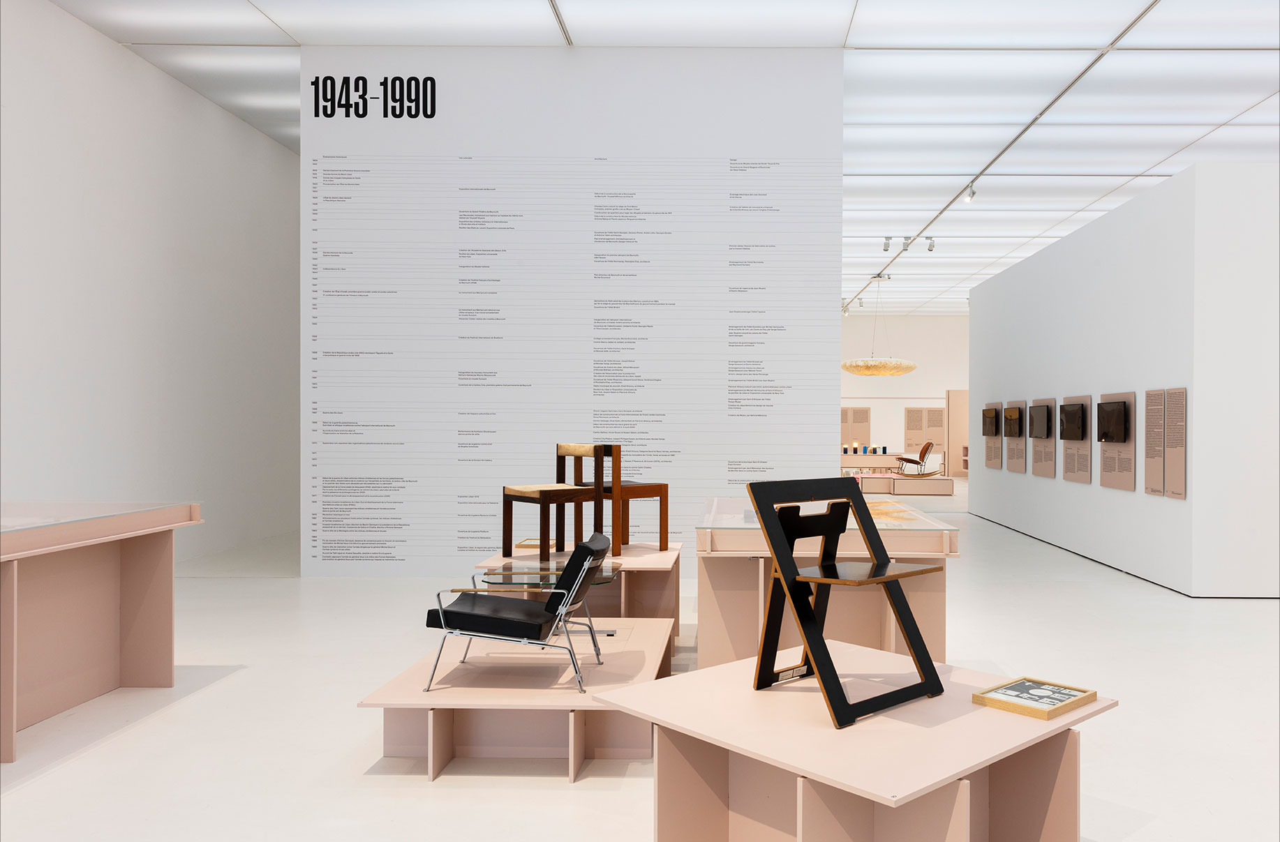
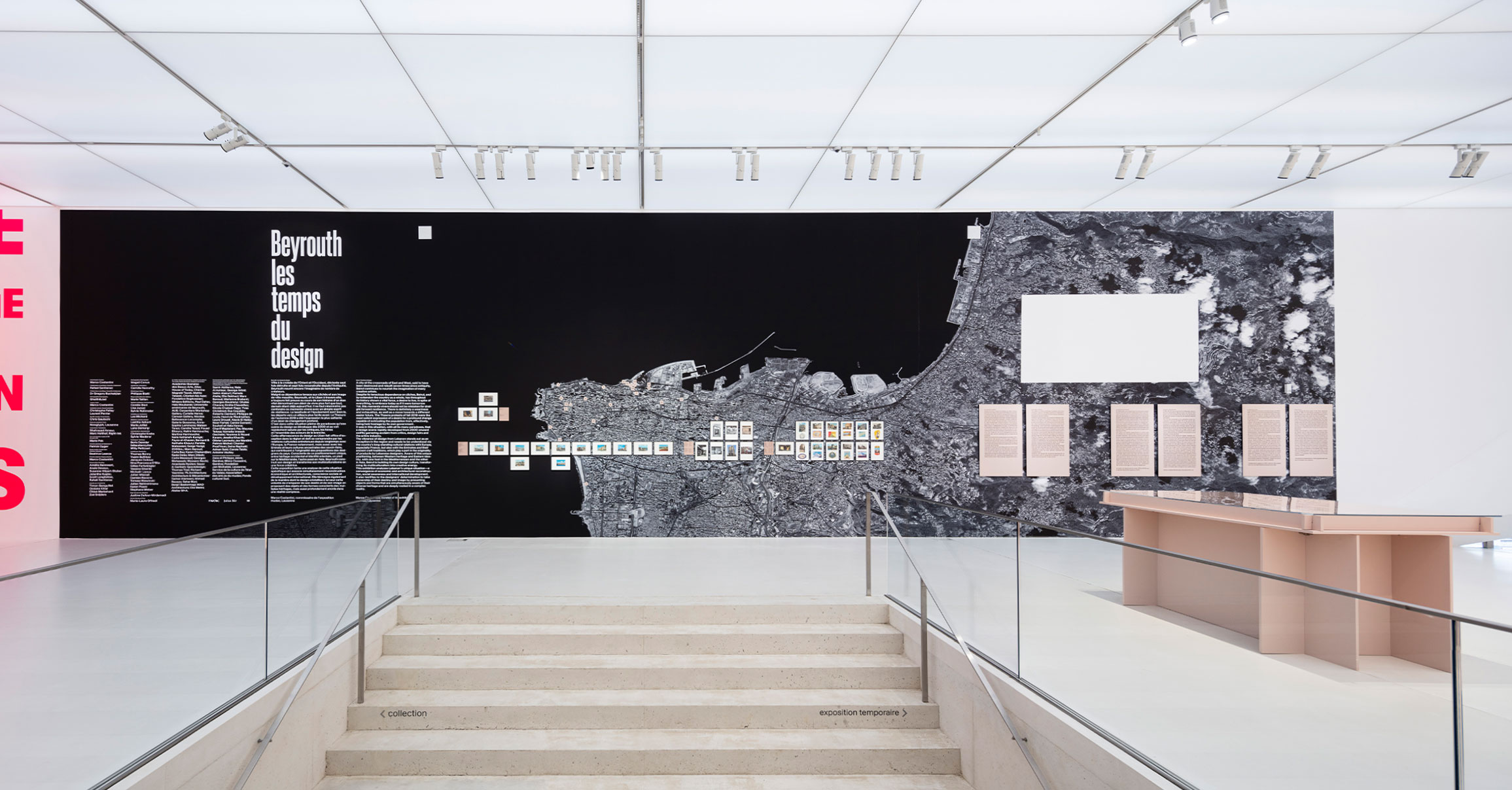
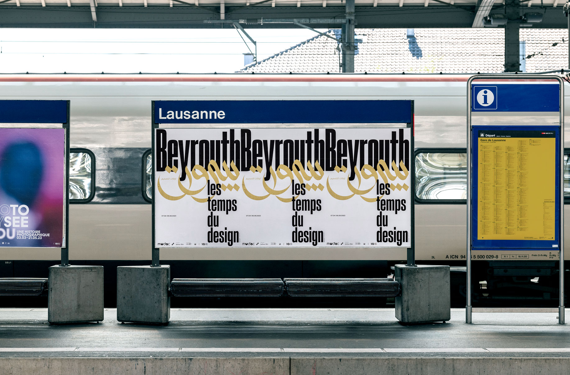
After the publication of his book “Beirut. The Eras of Design”, prompted him to design an exhibition for the MUDAC Museum in Lausanne entitled “Beirut. The times of design”. The aim was to capture for the first time the dynamic lines that made design development in Lebanon possible.
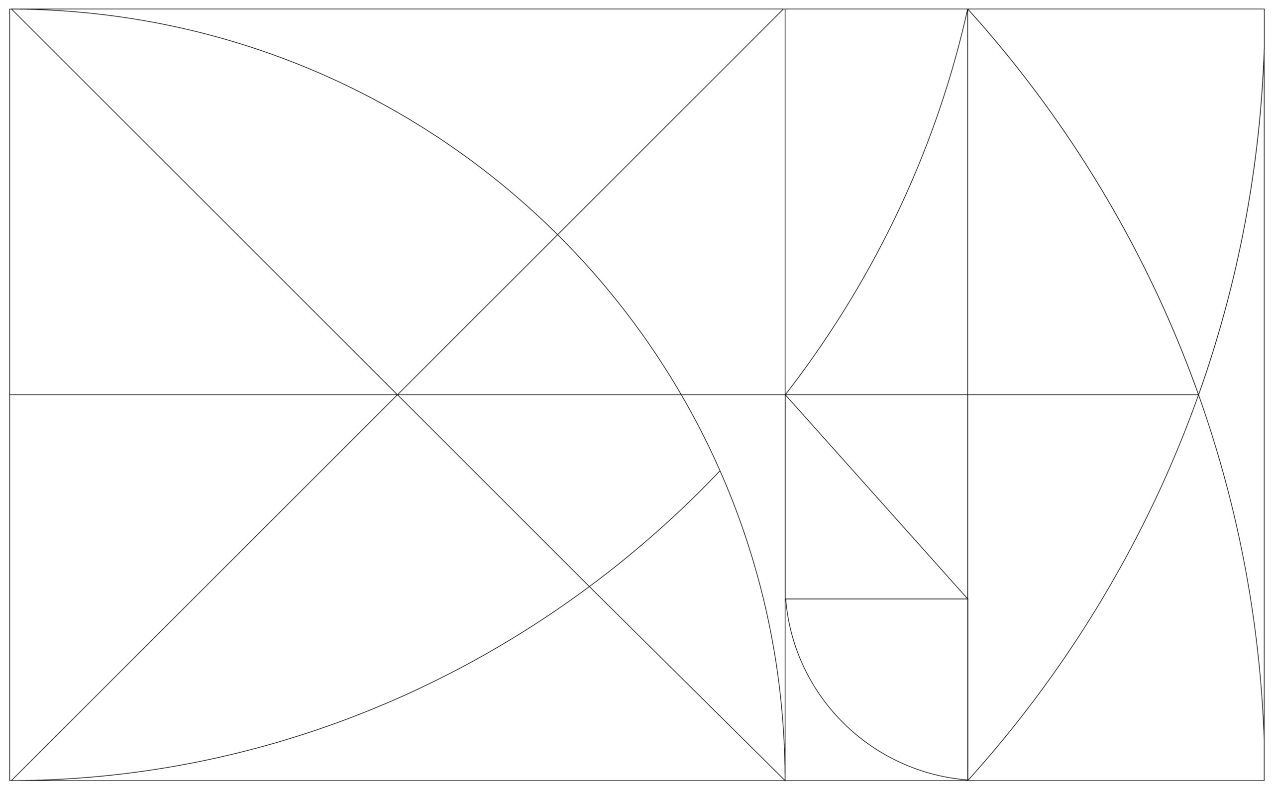
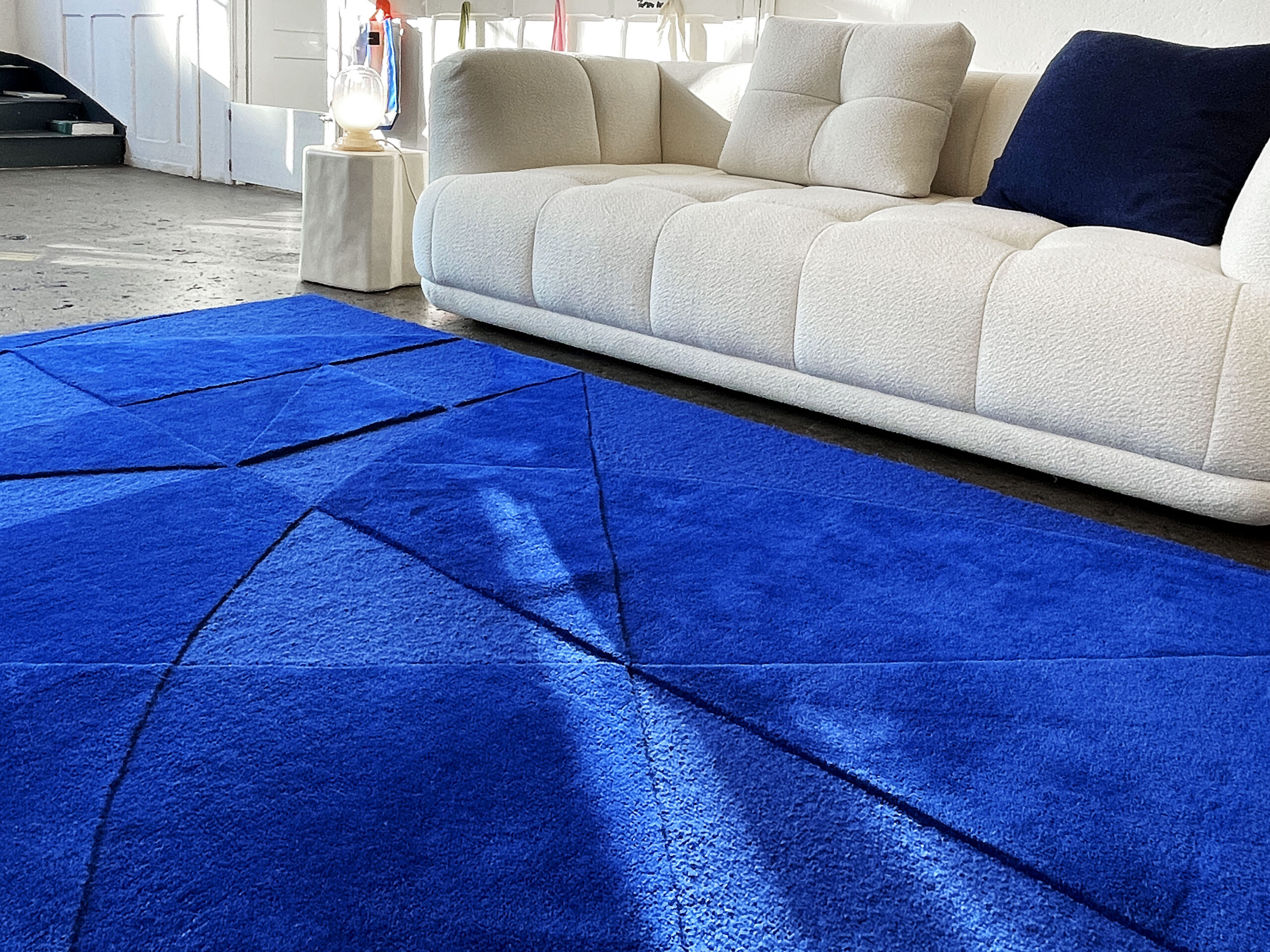
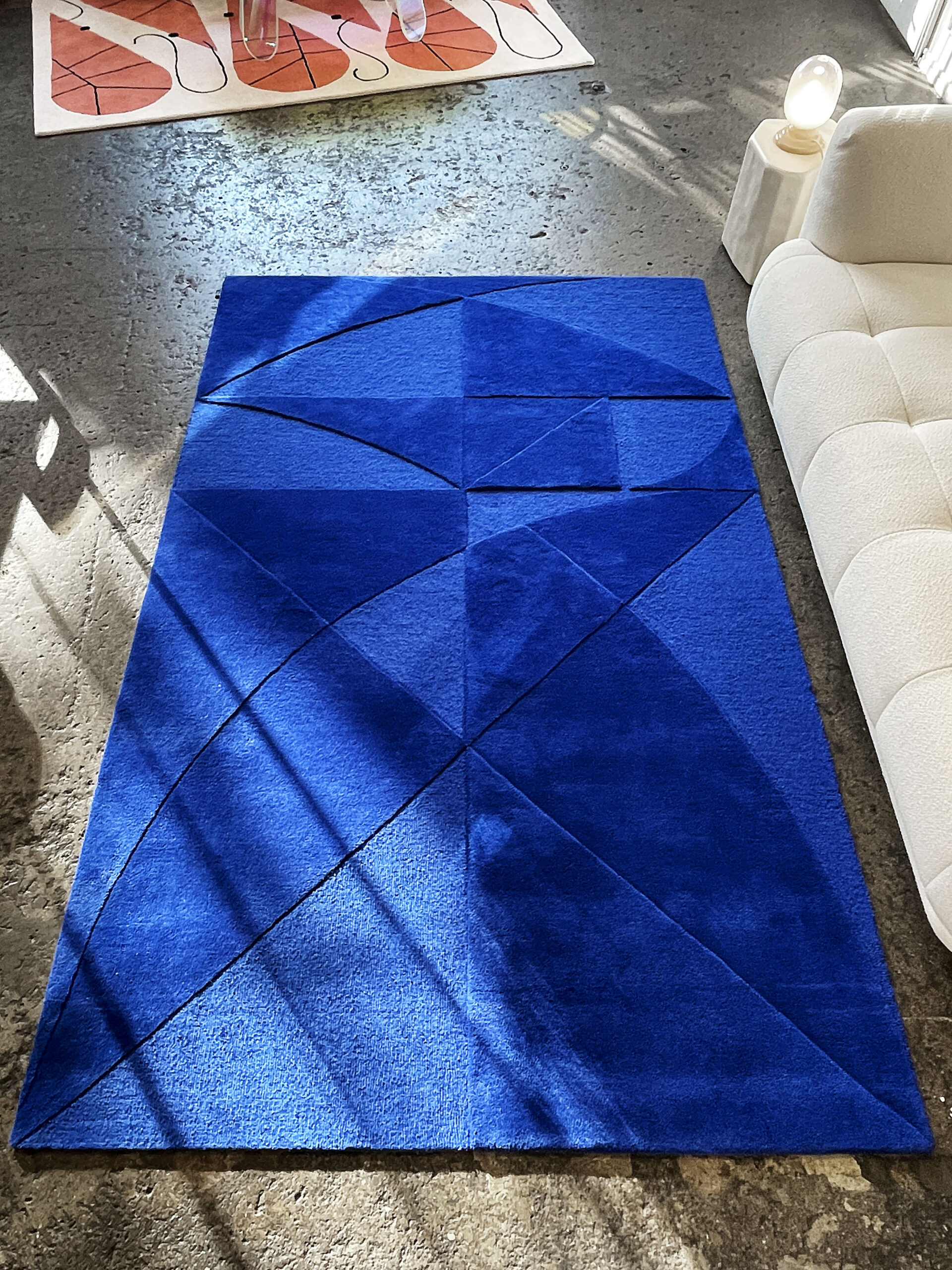
CG161803 the luminous faceted carpet of sacred geometry
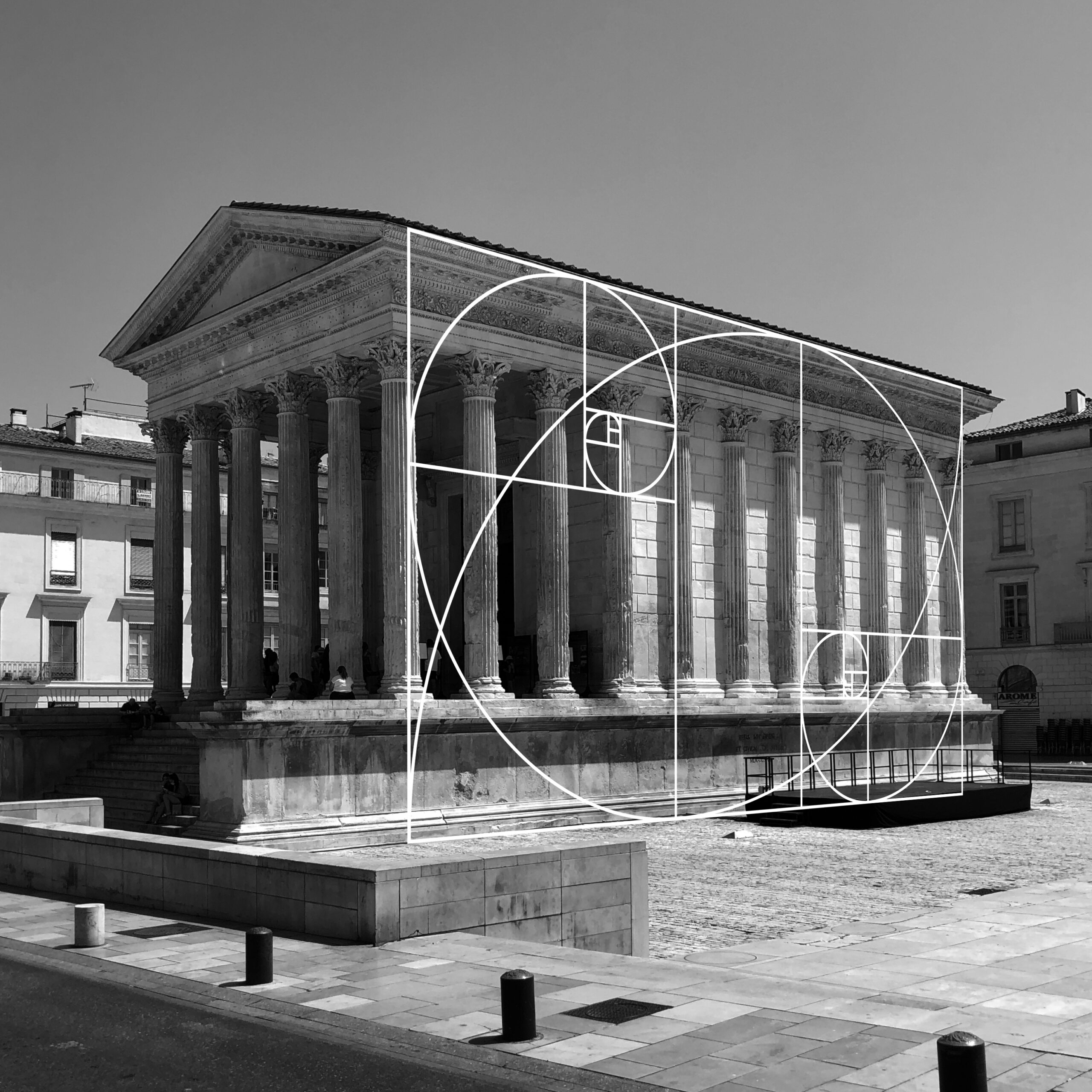
As for what lies behind this name, we would say that those of you who love logic, technical drawing and architects cannot ignore this ratio known as a number. Known as a composite number and the smallest expression of the golden ratio algorithm with 6 decimal places. It is the basis of the sign of the Holy Universe.
Over the centuries, mystical dimensions have even been attributed to it, with its origins lying in Pythagorean philosophy and the canon of beauty of Polykleitos. Both Botticelli and Da Vinci used this harmonic scale in the Renaissance. Le Corbusier later used this formula to create works of art such as the radiant city of Marseille and the Notre-Dame du Haut chapel.
FACES: Tell us about the importance of geometry in your design process.
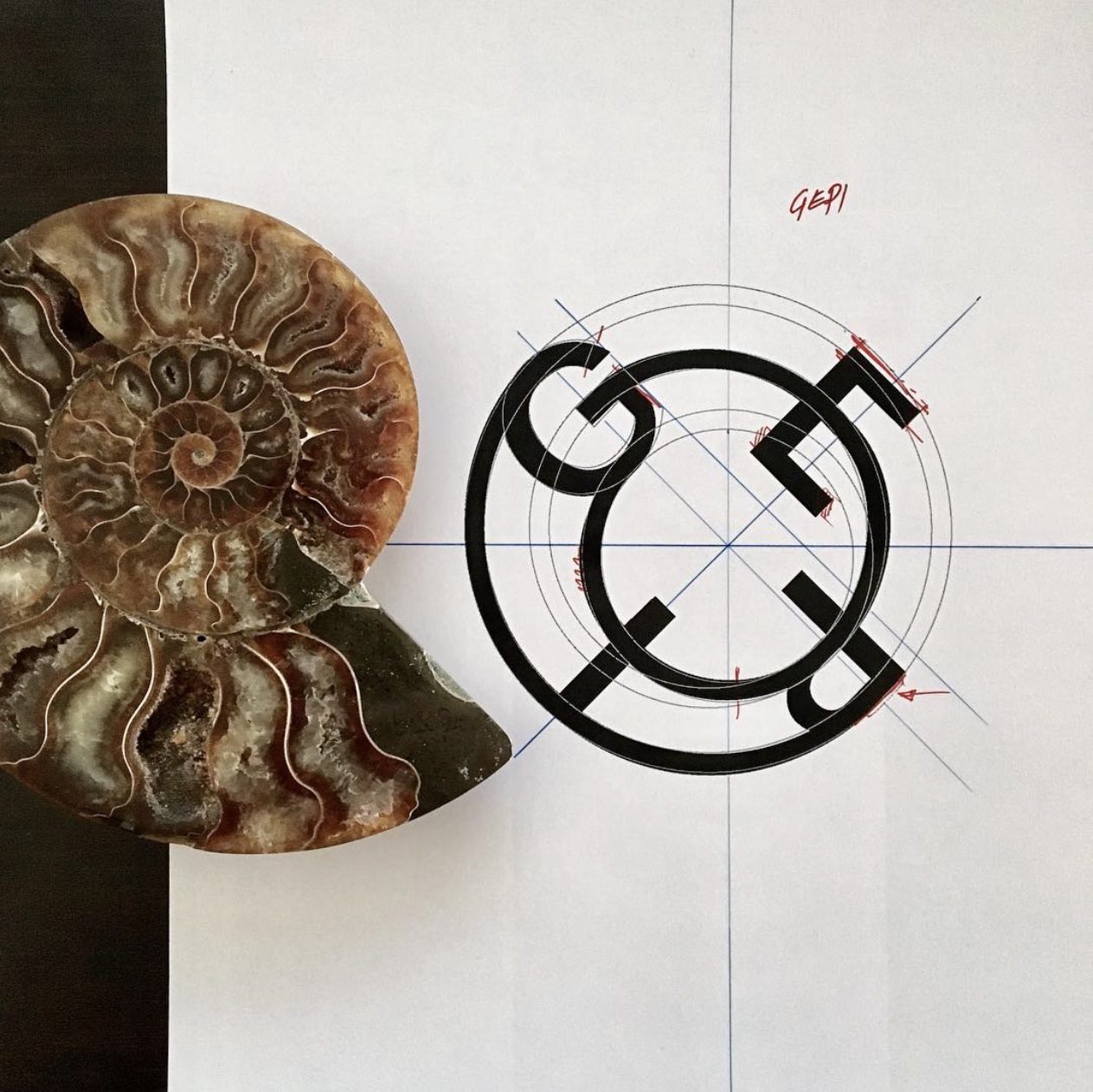
Chris Gautschi: Etymologically, geometry comes from the word “geo”, which means “earth”, and “metrie”, which comes from “metrona”, “measure”. This geometry is much more harmonious than mathematical. The golden ratio, called “AUR”, means light. So when you create something in the golden ratio, you connect with the earth, the universe and everything around us. This involves image proportions, text width, etc. To summarize, for me it is once again a matter of appealing to universal principles.
FACES: You have a special, like sacred bond with Le Corbusier, how did that come about?
Chris Gautschi:
I like to defend my position as a graphic designer who works with architects.
Perhaps in comparison to others, I have read a lot of the literature that architecture students should read. The connection I have to Corbusier is based on the fact that there are ambivalences and persistence in which I recognize myself. He is someone I like to read because there is always poetry. He was sensitive both to nature and to the way he built.
As a graphic designer, I developed a sensitivity for materials, such as the cover, the ergonomics and the format of a book.
“It was interesting for me to realize my passion for the omnipresent geometry and architecture in my work. A kind of skin that transmits the true light thanks to these golden proportions. This carpet reflects the colors of Le Corbusier’s Cité Radieuse.”
FACES:
What do you like best about the play of light in an interior?
Chris Gautschi: Minimalism with the little game that is created, as a gimmick, like when you pick up a greeting card, or you have a simple embossing, but with a single color, without having to add others. Through the different levels and harmonious shapes, we can see from a distance that something is happening, and up close it appears to be moving, even breathing.
FACES: What atmospheres do you want to put us in with these selected colors?
Chris Gautschi: I would like to come back to buildings like the Cité Radieuse in Marseille, these colors that we feel are fundamental. We still use these references because many architects use Le Corbusier’s colors so as not to take any risks. I would like to bring a piece of the Cité Radieuse home.
FACES: Where do your rugs look their best?
Chris Gautschi: I love Persian rugs myself, they are so beautiful, with so much detail, that I don’t like to put a table on them because they are almost works of art. You can even hang these rugs on a wall. This decorative rug should therefore be given space to be combined with small side tables. It is best placed where there is access to light, near a window.
FACES: Is this the beginning of a series of objects? Will you be making more physical products in the future?
Chris Gautschi: I will offer “Customs” according to the same principle and produce this tailor-made carpet in various formats. Basically, it was like a bet to create an extension of what I normally create. I already create objects, especially books and posters. I consider myself a designer, not just a graphic designer who is able to do different things.
Further information about Chris Gautschi www.chrisgautschi.ch – @chrisgautschi
You can find his designer rug at www.chiccham.com – @chicchamshop
Click here to visit the new Molteni&C flagship store in Frankfurt.
