Rooms reflect character and personality. But when does interior design become art, when do flourishes turn into kitsch, and when is minimalism simply boring? Phaidon’s “Interior” is both an inspiration and an encyclopedia and collects the legends among the apartments.
Fernando Bengoechea
Tony Duquette & Hutton Wilkinson
Project: Palazzo Brandolini
Client: Mr. & Mrs. John N. Rosekrans Jr.
Room: Salon
Location: Venice, Italy
Completion: 1980s
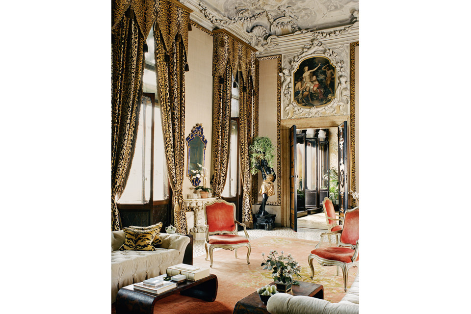
The Venetian Palazzo Brandolini on the Grand Canal was built in the 12th century. It was built in the 17th century by the Brandolini d’Adda family. Tony Duquette (1914-1999) and his business partner Hutton Wilkinson gave a room on the second floor sumptuous rococo and baroque-style decorations and a bold color palette. In the 1980s, the philanthropist and patron Dodie Rosekrans asked Duquette and Wilkinson to “give shape to a new life in Venice”. At that time, Duquette was already a well-known artist and designer. As Elsie de Wolfe’s pupil, he often integrated contradictory elements into a dynamic, eccentric whole. His projects have included interiors, jewelry, costumes and stage sets, and his clients have included the Duke and Duchess of Windsor, Gucci and Bergdorf Goodman. With his eye for the fantastic, he placed sofas next to leopard-patterned silk velvet curtains and an antique Oushak carpet, both from the 18th century. Century. According to Wilkinson, for Duquette every room should be more than the sum of its parts. “He always worked on site, adding layer upon layer, object upon object, listening to the room.”
© Courtesy of Amy Lau Design, Inc./Kim Sargent
Amy Lau
Project: House in Central Park West
Client: Private
Room: Living room
Location: New York, NY, USA
Completion: 2010s
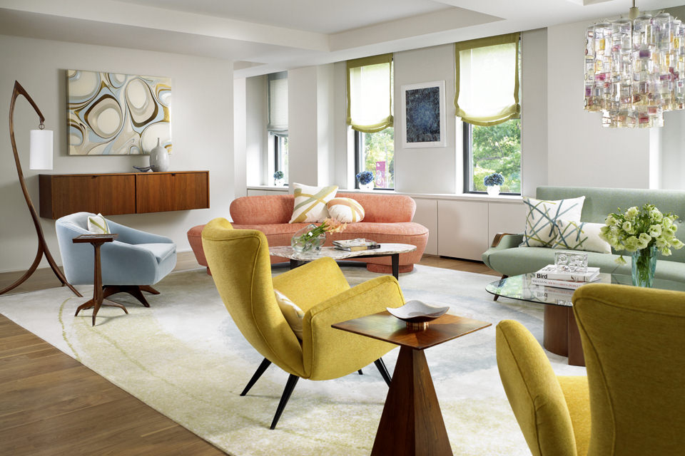
Arizona-born interior designer Amy Lau founded her office in New York in 2001. Since then, she has designed a variety of luxury residential projects as well as installations for brands such as Kohler, Bergdorf Goodman, Lladró and Baccarat. In her interior designs, she combines her naturally warm artistic vision with a well-founded approach based on her training in both fine and decorative arts and 20th century design. century is well versed. Her aim is to create spaces that she describes as “lively and meaningful”. She creates very personal living spaces with vintage and modern furniture and location-specific designs. For a family home in Manhattan’s Central Park West, this included a bespoke wall inspired by the contours of Alvar Aalto’s Savoy vase, which improved the flow of space in the L-shaped apartment. This wall surrounded a huge pillar in the entrance hall and led visitors past the kitchen and into the living area. As the centerpiece of the apartment, this room contains several pieces of upholstered furniture from the mid-20th century. The design is in bright coral, delicate blue, mustard and mint tones. A tailor-made carpet gives the seating area a harmonious look.
© Succession Yves Klein c/o DACS 2019
Yves Klein
Project: Small apartment
Client: Yves Klein
Room: Living room
Location: Paris, France
Completion: 1949
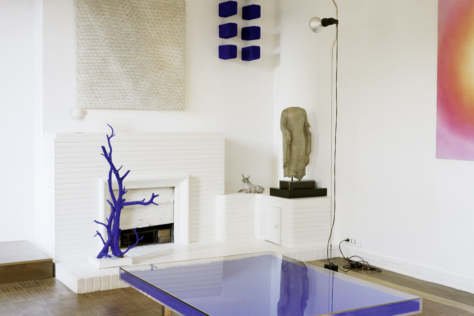
Yves Klein (1928-1962), became famous for his blue color mixture, the patented International Klein Blue (IKB). He lived in this Paris apartment with the German artist Rotraut Uecker. Before he moved in, the walls, doors and a brick fireplace were painted white. This room reminded Rotraut Uecker of Le Vide (the void), the empty rooms presented as works of art in the Iris Clert Gallery. Critics and artists such as Pierre Restany, Niki de Saint Phalle, Jean Tinguely and Christo were often to be found here. By turning away from representations, Klein saw his monochromes as the realization of artistic freedom – or in his words: “as the attainment of immateriality”. After Klein’s death in 1962, Rotraut Uecker had the acrylic coffee table shown here painted in the iconic bright blue. When she is in Paris, she still uses the apartment, but leaves the central room as it was during Klein’s lifetime. “I thought everything should stay as it is. You can sense the creative richness, the diverse events and the extraordinary art that he created here.”
© Courtesy of Philip Vergeylen, Photo: Clive Nichols
Paolo Moschino & Philip Vergeylen
Project: London apartment
Client: Paolo Moschino & Philip Vergeylen
Room: Salon
Location: London, England
Completion: 2012
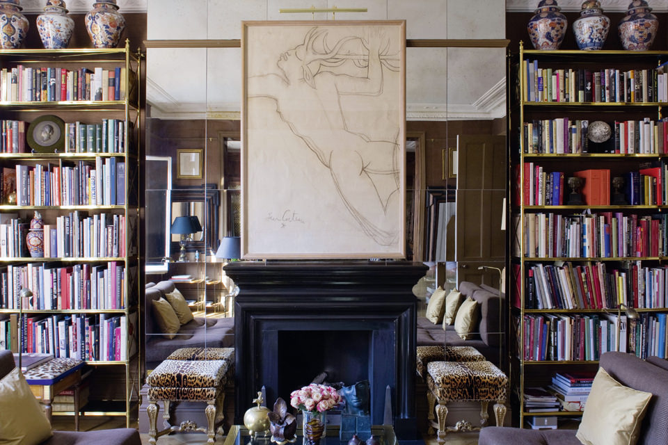
Paolo Moschino, who moved to the UK after studying social sciences in his native Italy, did not have the usual entry into the world of design. In 1995, he bought the company Nicholas Haslam and now runs its business in central London together with Philip Vergeylen, a former marketing manager from Belgium. The company style has constantly evolved: While it initially stemmed from English design, it has become more international since the takeover by Moschino and Vergeylen. The continental flair also manifested itself in her own apartment. “It didn’t look like a London apartment; it looked like a Paris apartment. The ceilings were much higher, the rooms much wider,” said Vergeylen. They wanted to create an inviting atmosphere. To this end, they created a dining room and doubled the size of the salon. This room is suitable for socializing and is divided into two halves: One is luxuriously decorated in 20th century style. The other, with dark pine wood paneling and heavy silk curtains, is influenced by the two previous centuries. A mix of styles pervades the entire apartment, although works by Jean Cocteau, large mirrors and the oak parquet flooring act as unifying elements.
Vladimir Kagan Design Group
Vladimir Kragan
Project: Villa
Client: Private
Room: Living room
Location: Forest Hills, NY, USA
Completion: 1950
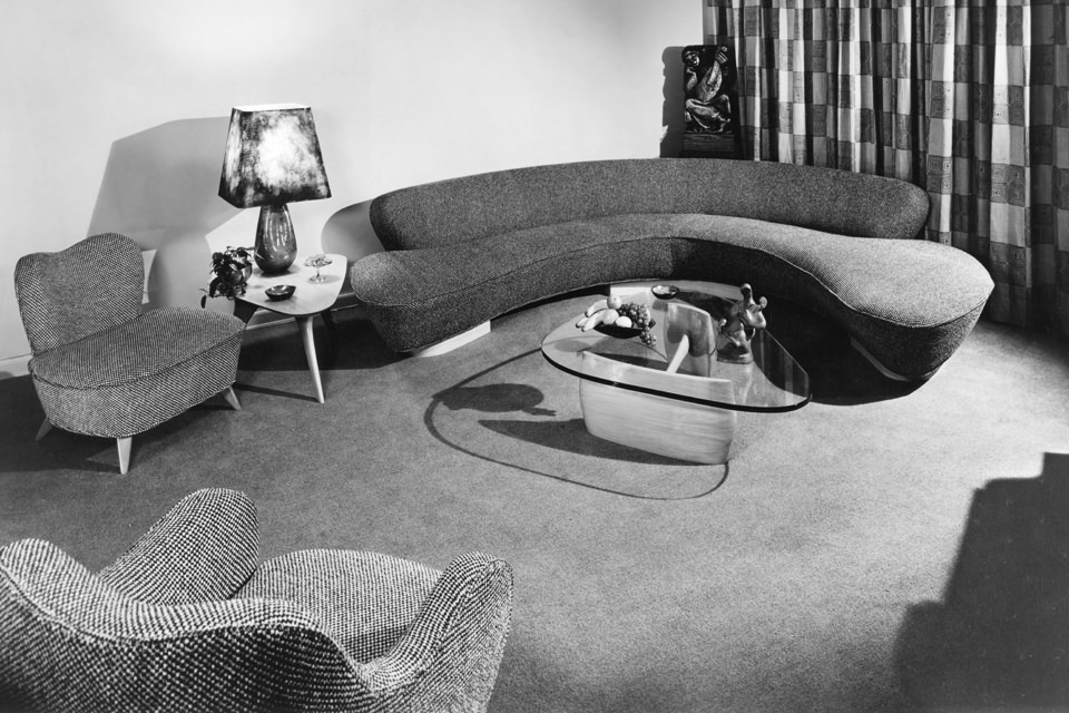
In this living room, a glass coffee table fits into the corresponding curve of an oversized sofa by designer Vladimir Kagan (1927-2016). Margaret Russell once said that his furniture looked like it was talking. Kagan was born in Germany in 1927 to Russian parents and fled to the United States with his family to escape the Nazis. There he studied architecture at Columbia University while working for his father, a master carpenter. After graduating, Kagan opened his own office. This commission shows his characteristic cloud shapes, which influenced designers such as Zaha Hadid. Kagan is known for its long, low sofas, three-legged glass tables and body-hugging chairs. His interest in ergonomics and anatomy led to what he called “containers for the human body”. Sofas and chairs were modeled to support the back according to the curvature of the spine. Kagan is a pioneer of sensual furniture with soft textures and dynamic curves. His products are collected worldwide and have been taken up by many modern designers.
© The Archers/Richard Petit
The Archers
Project: Silver Lake House
Client: Sharon Oreck & Bill Pope
Room: Library
Location: Los Angeles, CA, USA
Completion: 2017
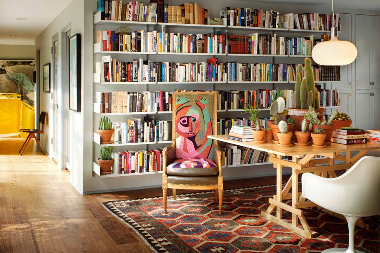
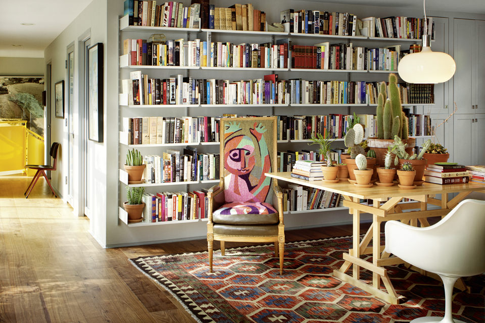
A metal spiral staircase painted cadmium yellow now adorns the Silver Lake House of film producer Sharon Oreck and her husband, cameraman Bill Pope. It is the work of the Archers, a Los Angeles-based group of designers, architects, artists and film buffs, as they describe themselves. They skillfully use site-specific furniture and finishes, giving each project, whether private or public, its own identity. The yellow staircase by Oreck and Pope is one such example, designed to improve the flow of movement in the 1940s house on a hillside, which was previously a series of rooms that were difficult to access. “Taking our cue from the boxy dimensions of the house and its many new aluminum-framed windows, and responding to the client’s enthusiasm for color and pattern, we incorporated a number of colorful high-gloss elements and placed them against a pale gray background,” the designers said. The result is an eclectic but cohesive space where collector’s items are easily arranged alongside contemporary pieces and custom-made designs.
© Courtesy of Ashley Hicks Studio
Ashley Hicks
Project: Hicks Set In The Albany
Client: Ashley Hicks
Room: Living room
Location: London, England
Completion: 2015
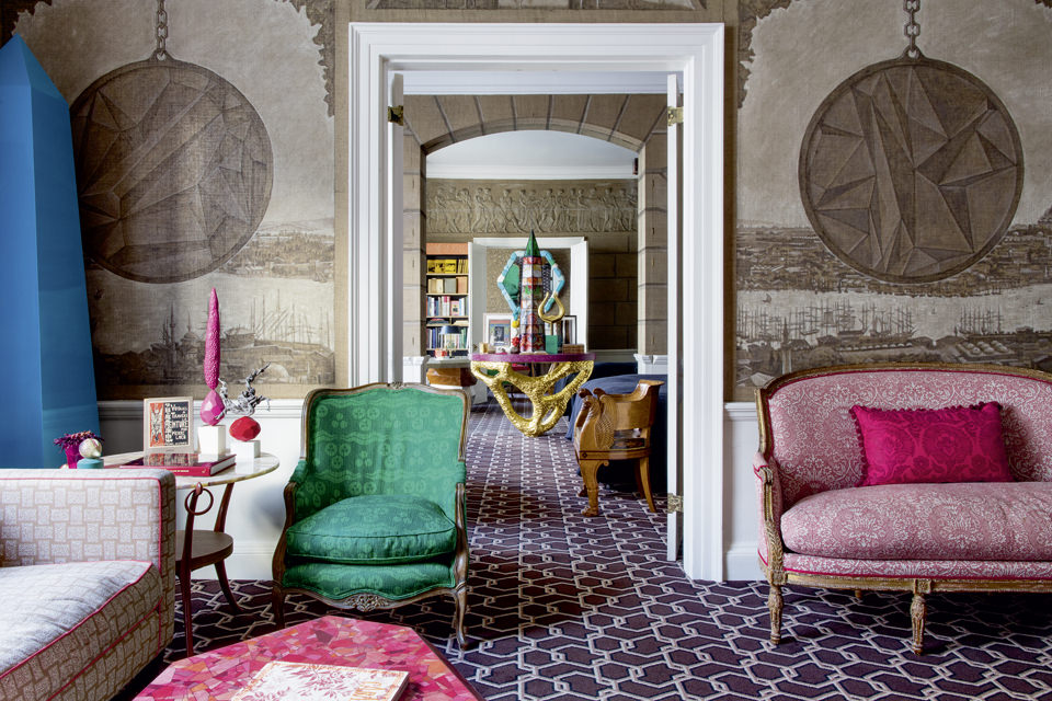
The London home of interior designer Ashley Hicks is located in the Albany, a very exclusive residential complex. Over the past two centuries, this complex has been home to personalities such as Lord Byron, J.B. Priestly and Aldous Huxley. Ashley Hicks inherited the interior from his father, the interior designer David Nightingale Hicks. It playfully combines the bold eclectic style of his father with his own modern and anachronistic ideas. Little of his father’s original furnishings have been preserved. The former antiques and exhibits have been replaced by Ashley Hicks’ contemporary, colorful objects. He often created them himself: a huge stone made of cast resin stacked into towers, a gilded, hand-carved table made of pine wood, obelisks in bright colors or covered with photocopies of jewel-colored onyx. All refer to unadorned, more subtle versions of his father’s original design. Ashley Hicks’ signature is also evident in the sepia murals depicting Constantinople in 1818 in the living room, overlaid with ceremonial Roman pendants and topped with depictions of his chickens, which he keeps at his Oxfordshire estate – a typical appropriation, as he puts it, of “historical layers with a modern flair”.
© Manolo Yllera
Lorenzo Castillo
Project: Casa Santiago Castillo
Client: Santiago Castillo
Room: Living room
Location: Madrid, Spain
Completion: 2010
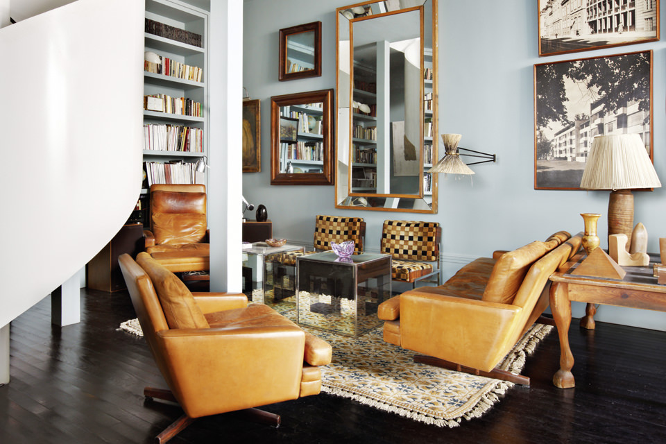
When the Spanish painter Santiago Castillo decided to modernize his apartment in Madrid, help was quickly at hand: his brother is the internationally sought-after interior designer Lorenzo Castillo, who is admired for his residential projects, hotels, restaurants and retail stores. Lorenzo, who started out as an antique collector, designs his own pieces as well as fabrics, trims and wall coverings for Gaston y Daniela. He is also known for his skillful mix of old and modern pieces. After completing his art history studies at the Universidad Complutense in Madrid, he opened his store in 1992, a treasure trove of exquisite, slightly dusty pieces. Soon customers were asking him to design their interiors. To this end, he combined his knowledge of the history of interior design with a contemporary awareness of color and pattern. Lorenzo fitted out his brother’s loft with a new black wooden floor, softened by an enviable collection of vintage rugs. Comfortable tobacco-colored seating counterbalances the white spiral staircase, and a sophisticated color scheme highlights a large collection of mirrors, vintage photos and Santiago’s own artwork. The result is both elegant and inviting, classic and comfortable – typical Castillo.
© Kate Martin/Jan Showers
Jan Showers
Project: Belgravia townhouse
Client: Lauren Gurvich King & Jeremy King
Room: Living room
Location: London, England
Completion: 2015
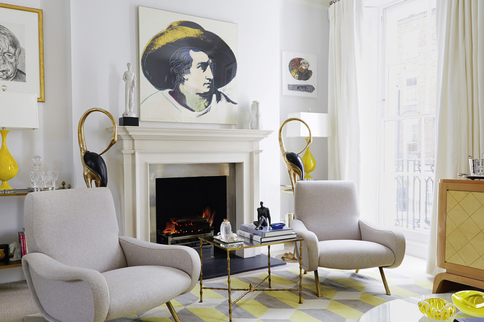
“You should look good and feel great in your rooms; otherwise why bother?” Dallas designer Jan Showers once said. She is known for her timeless interiors that reflect the personality and lifestyle of her clients. She only follows trends in a moderate way and believes that every room should contain at least one antique piece. In 1999, she founded The Collection, a series for resellers with high-quality furniture and lighting. In 2018, she launched 1308, a furniture collection that is available online and in her showroom in the Dallas Design District. She opened this in 1996 to sell antique and vintage objects that she collects on her world travels. Lauren Gurvich King, who deals in 20th century design objects, and her husband Jeremy bought this landmark Belgravia townhouse from renowned interior designer Jane Churchill, who had decorated it in her classic, elegant style. The couple asked Showers to help them choose fabrics and furniture to complement their extensive collections. In the living room, two Marco Zanuso ladies’ armchairs frame the fireplace along with a pair of Art Deco crane statues. Gray walls complement the Chiesa Yellow rug designed by Suzanne Sharp for The Rug Company.
Studio Joe Colombo/Ignazia Favata
Joe Colombo
Project: Visiona I
Client: Joe Colombo
Room: Living room/bedroom
Location: Milan, Italy
Completion: 1968
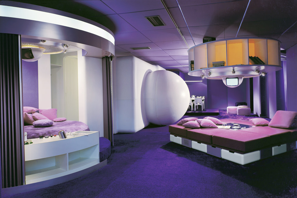
Joe Colombo began his career in the 1950s as a painter and sculptor. When he turned to design in the 1960s, his importance grew at a time when many shared a common utopia with regard to architecture, design and the world. This interior with its bold shapes and independent living units was commissioned by the Bayer chemicals group in 1968 as part of a project to design an open living area on a ship for the Cologne Furniture Fair. The aim of the exhibit was to present the possibilities of newly developed synthetic materials for a “life of the future”. The units designed by Colombo emphasized flexibility and adaptability, regardless of structural constraints.

Interior. The most stylish living spaces from 100 years
400 rooms in more than 25 countries by over 300 architects. Prestel puts all this between two velvet book covers. “Interior. The most stylish living spaces from 100 years” is an illustrated book for all those who eagerly await the new Ikea catalog more than winter fans await the first snow and for whom furniture is more than a commodity. William Norwich, “Interior. The most stylish living rooms from 100 years”, Prestel, ca. 95.-


